@MeeJ All of the components planned for this term are now created and merged, it would be great if you could provide some feedback for these components :
2 Likes
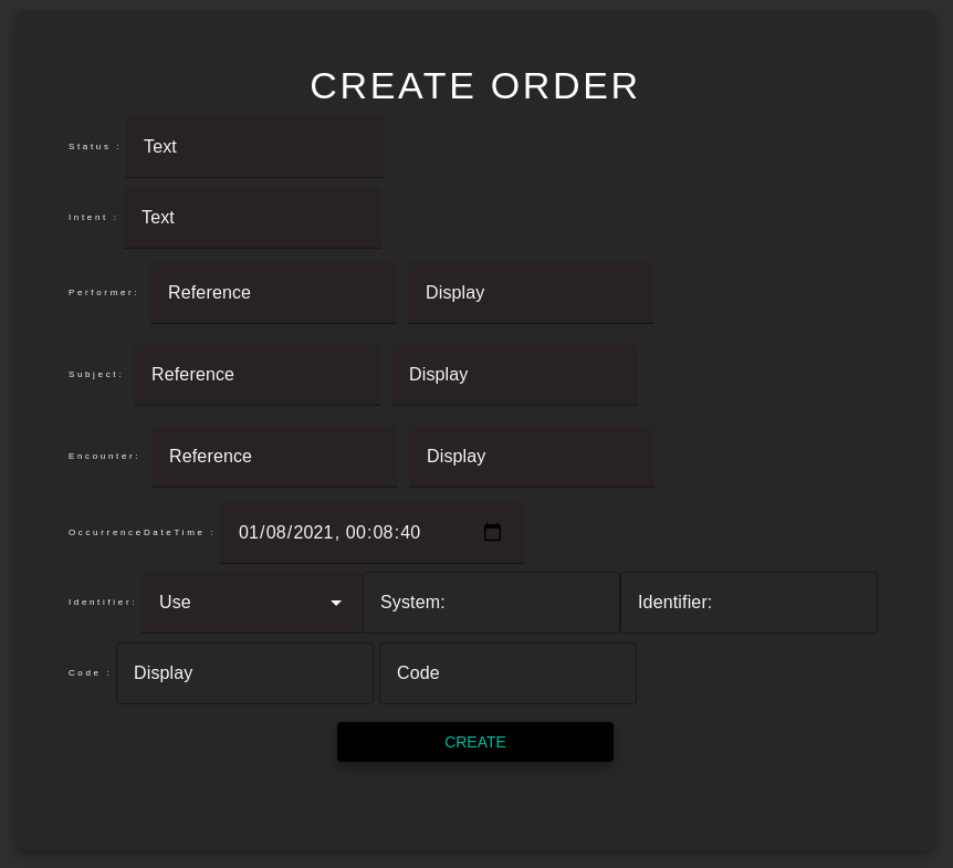
@sunbiz @MeeJ Would it be better if all the text-fields be either filled (preferably) or outlined ?
like here below : won’t it look better if all the fields were filled rather than some being outlined and some filled ?
Hi @Shashwat Sure, I will go through them today and will get back to you with feedback.
1 Like
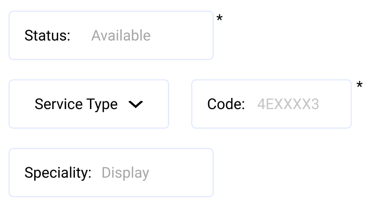
Hi, @Shashwat I do feel that in the input field space, instead of keeping the placeholder as “Text,” adding a status value in a lighter text color would be intuitive for the user to understand. For example, if you look at the code field in the attached screenshot, the user need not see the entire code, but an example with format would make it easier to fill forms. Also, if you could add asterisks to indicate mandatory fields, that would be a good practice.
Kindly let us know what you think @sunbiz
Thank you, Meenal J
1 Like
Thanks a lot for this feedback @MeeJ!
@sunbiz Almost all of the resources accept empty data values(all fields unfilled), without any validation error. So which fields should be put in the required category ?
I can’t find the issue where we discussed this, but required fields should be left to the implementation of the web component on a page, and not on the element itself.
There are probably many issues with this concept, but one that’s obvious is that the FHIR standard for a resource has many required fields. If an implementer does not make those required fields then will get an error from the API. Maybe we should require those fields that are required by the standard?
2 Likes
@sunbiz As I had mentioned in the proposal, the last 2 weeks included working on some extra admin and user profile page and some bug fixing in the react application. As we are not using a real server / database (can’t modify existing user data) what should these pages contain?
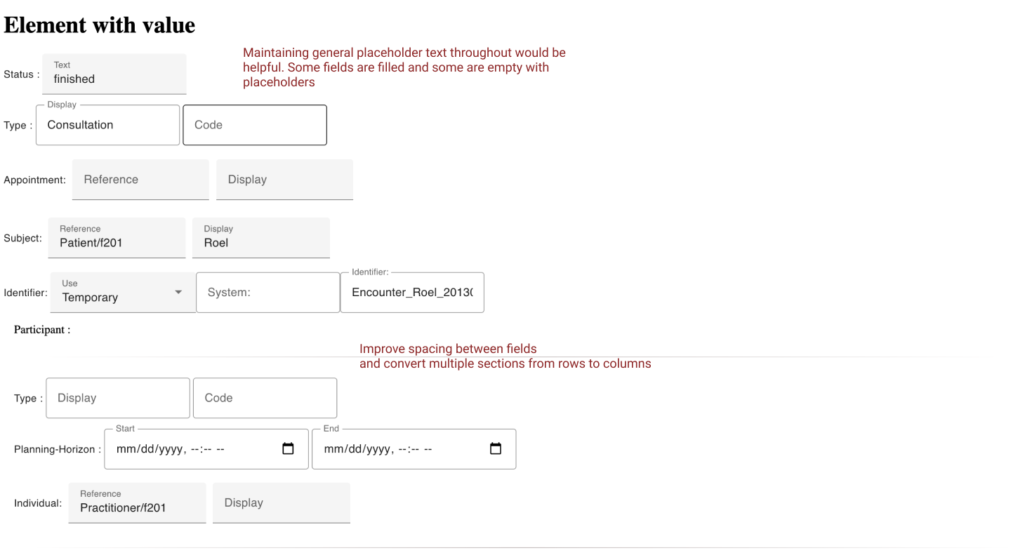
Hi @Shashwat, I went through the components that you linked above and had similar feedback for almost all of them. I have added my comments in the attached screenshot that can help in improving the UI and UX of these forms. I felt the fields are not consistent; some had placeholders as value, whereas some had labels. This can confuse the user. Also, if could you improve the spacing as this might look cluttered for the user. The comments in the below image are applicable for other components too.
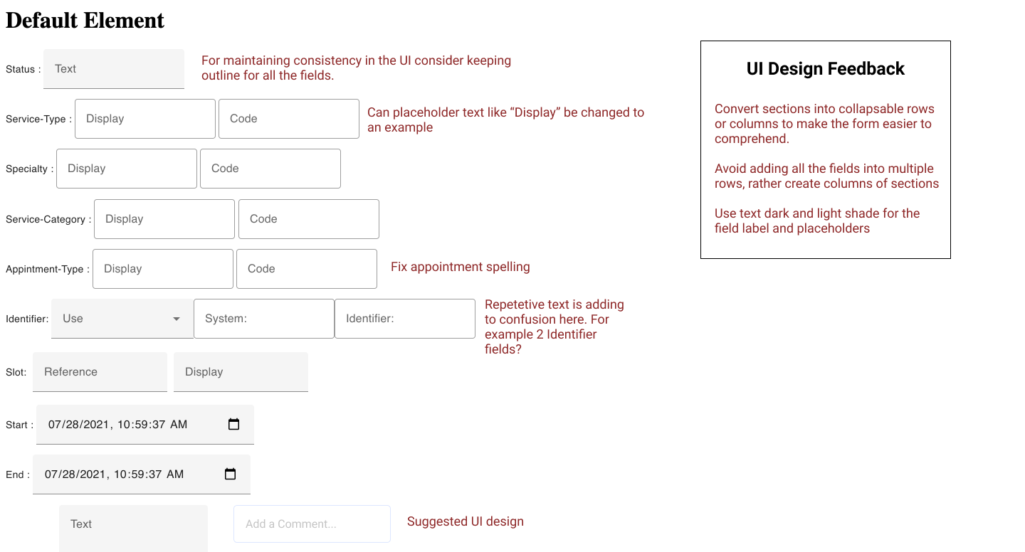
I hope this helps! Regards, Meenal J
1 Like
@sunbiz can you please take a look at this MR before others …
I’ve implemented most of the above mentioned pointers in the Appointment component, I’ll do the same for all the components if this is fine. Thanks!
@r0bby @sunbiz I have created the final report here : GSoC_2021_Final_Report.md · GitHub. Just wanted your approval before submitting this along with the final evaluation.
Thank you for doing this! I am really proud of all of you!
@sunbiz, made some UI changes in this MR, wanted to know your thoughts about these… thanks!
@sunbiz thanks a lot for your mentorship during the summer. I have had a great experience and would love to continue working on this project beyond the program.
2 Likes